Infographics, images depicting data or stats, are used frequently by businesses and organizations both in print and on digital mediums as well. They offer clear, effective, and artistic ways to display information, statistics, and other data so that the content can be more easily digested by readers.
Lately, infographics have been a popular way to communicate important information and safety protocols amid the ongoing COVID-19 pandemic, economic reopening, etc. However, infographics are very versatile and can be created for a wide range of topics and content for use in various industries.
Here are three reasons you should use infographics as part of your graphic design and communication strategy.
1. Visually Appealing
Human beings are highly visual in nature. According to a study done by Microsoft, the average human being has an attention span of just eight seconds. Therefore, information is better perceived and more likely to be read if it’s presented in an attention-grabbing, attractive way. Compared to plain text, infographics offer a much more fun way for readers to view information, plus the information is absorbed and understood much faster visually.
2. Simplify Complicated Information
Information overload is real. When data is shared in a way that appears overwhelming – I.E. paragraphs and paragraphs of text and figures – it can be very hard for a reader to comprehend.
By extracting and including only the most essential numbers, statistics, and data, infographics effectively communicate a breadth of information in a small space and ultimately make complex information more understandable.
3. Added Brand Value
Creating an infographic offers a way to help demonstrate your business or organization’s expertise and familiarity with the topic at hand. Additionally, it enables you to provide value-based content to your audience and allows for the integration of your company’s branding – logo, website URL, contact information, etc. – in the design as well.
Creating a simple infographic is relatively straightforward and easy. Online, there are various, free design tools available, such as Canva, that can help. See below for some tips to keep in mind when creating your infographic.
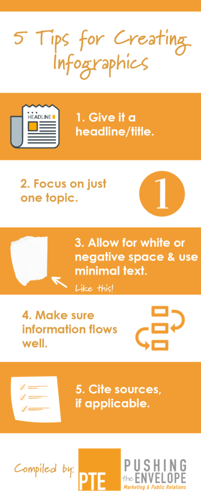
- Give it a headline/title that will grab a viewer’s attention. It should capture what the infographic is about and be shown in text that’s a bit larger than the rest.
- Focus on just one topic. It will get too confusing if you start combining information on varying topics.
- Allow for white or negative space and use minimal text. This will help keep the design from getting too busy or cluttered.
- Make sure information flows well. Consider how the data is best presented and will be most easily interpreted… in a chart, in a graph, using icons, Then, use your company’s brand guidelines to select appropriate colors and fonts. However, keep these limited – I.E. limit your color palette and stick with just one or two fonts.
- Cite sources. When researching and sharing data from resources other than yourself, don’t forget to give them credit. You can do so by listing URLs under the infographic, in the social media caption, etc.
Canva is a free, easy to use tool that can help you make beautiful, on-brand infographics and other designs. However, you can also create them in a variety of Adobe products and with other tools, too.
Going forward, remember to consider the benefits of using infographics to convey complex information and provide valued content to your customers.
For more information on how PTE can help you manage and share content, as well as create compelling infographics or other designs, contact us.


